TWO FOLIOS FROM DIFFERENT KUFIC QURANS ON VELLUM, NORTH AFRICA OR NEAR EAST, 9TH-10TH CENTURY
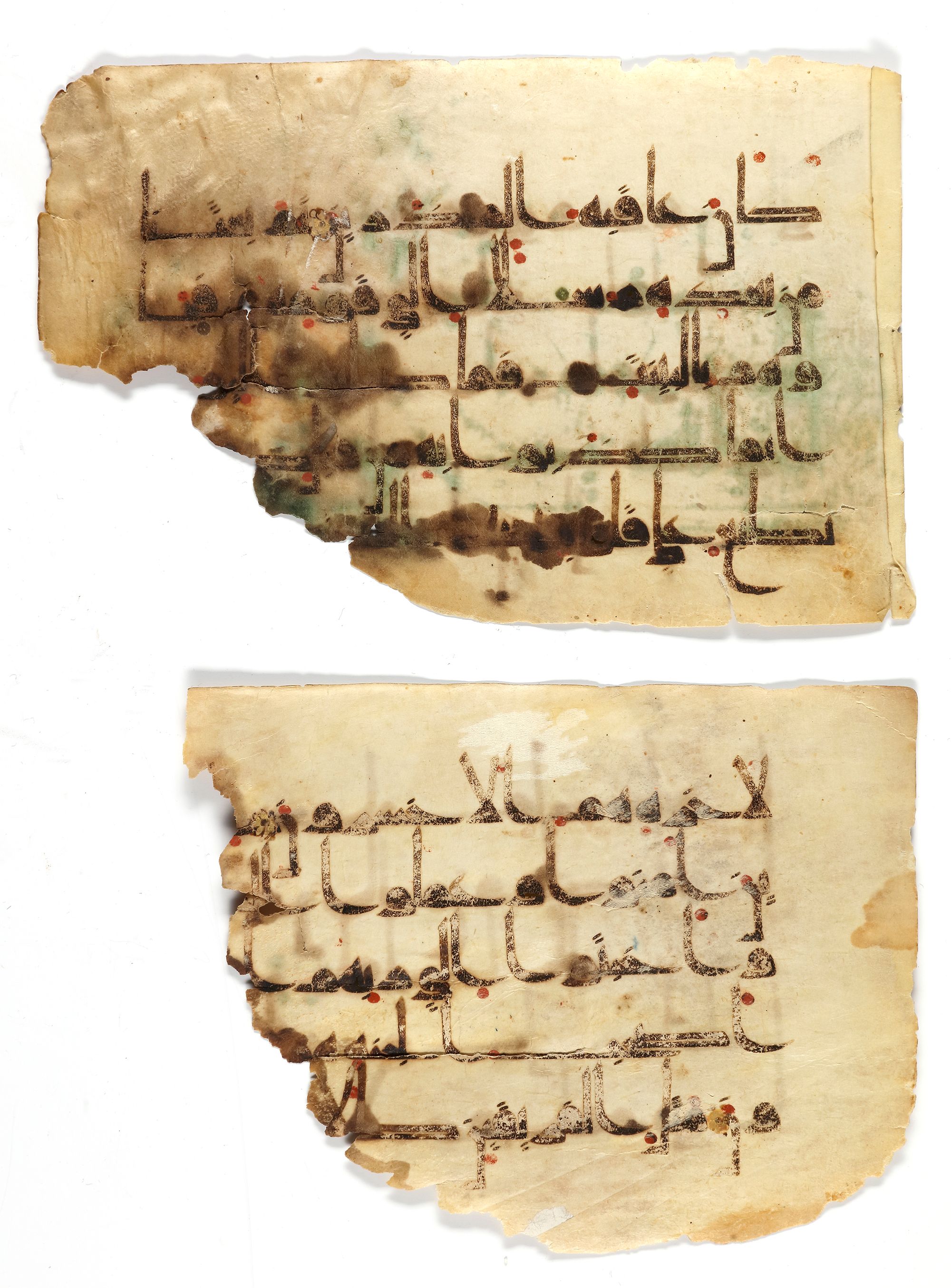
The first manuscript folio in Kufic script, black ink on vellum. Surah Yunus (Jonas), verses 73-76, marked with gold dots, fifth verse marked with a circular illuminated device in gold, with 5 lines, diacritics and vowel points in green and red. The folio slightly faded side and damaged either corroded or burned. 18 by 12 cm.
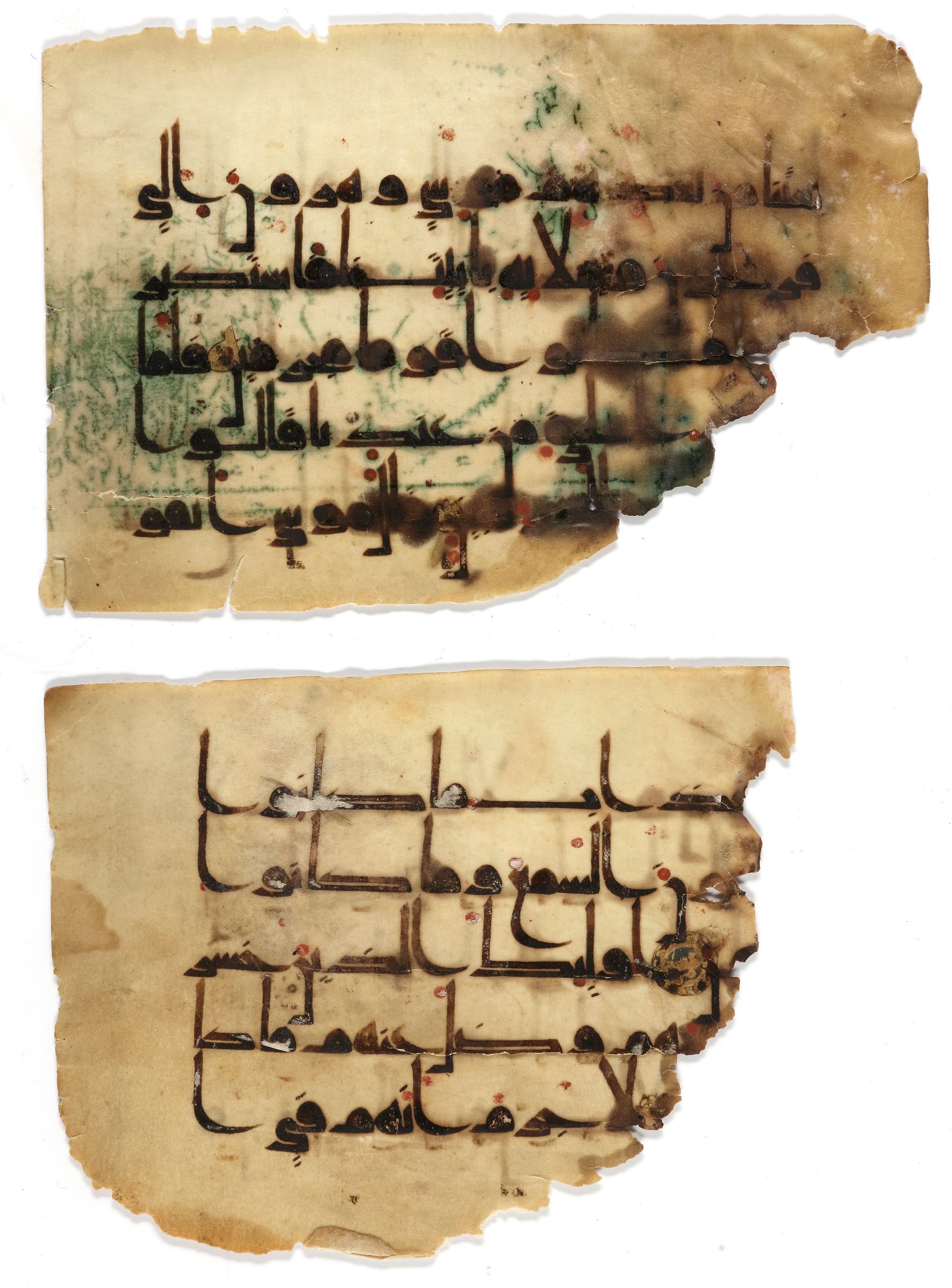
The second manuscript folio in Kufic script, black ink on vellum, vocalization, and diacritics in red, with 5 lines. Surah Hud (Hud), verses 20-24, separated by polychrome and gold. The folio loses edges either corroded or burned. 15 by 12 cm.
CATALOGUE NOTE While many Kufic folios appear on the market as single folios or small sections, this elegantly executed Kufic section is an extraordinary survival. Not only is it composed of a substantial 169 folios, but these folios are consecutive and include sixteen gold illuminated sura headings. The remarkably preserved folios would have formed part of a lavish commission and clearly present the harmonious geometry displayed by these magnificent Kufic Qur’ans of the ninth century. The script and illumination of this manuscript are closely comparable to two folios in the Khalili Collection (inv. nos. KFQ13 and KFQ14, Déroche, 1992, pp. 54-55, no. 9). Following Déroche’s classification of the early Abbasid scripts, the script of our section is stylistically closest to the B.II type, characterized by its relatively small size and thick strokes (1992, pp.35 and 38-9). While the geometric elegance of the Kufic script as a whole is clear, it is particularly pronounced in this type of script. Déroche notes that B.II manuscripts have more strictly detailed proportions than other types, and our manuscript conforms to the ‘ideal’ of 16 lines to the page (ibid., p. 54). The script presents a fine balance of extended, horizontal ya terminals, which counter the perfectly rounded mims and generously curved qaf and ‘ayn terminals. These letters are, in turn, punctuated by short slightly hooked vertical alifs and ta/as, along with similarly vertical nuns descending below the line. These vertical strokes create a gentle rhythm to the text panel exemplifying the careful consideration that would have gone into the calligraphy.